The power, and danger, of visualizations
I recently posted about visualizing the voting patterns of senators. In the post, I scraped voting data for each senator on every vote in the 113th Congress from the Senate website, and then assigned a code of 0 for a no vote on a particular issue, 1 for a yes vote, 2 for abstention, and 3 if the senator was not in office at the time of the vote (ie, a senator was switched mid-term).
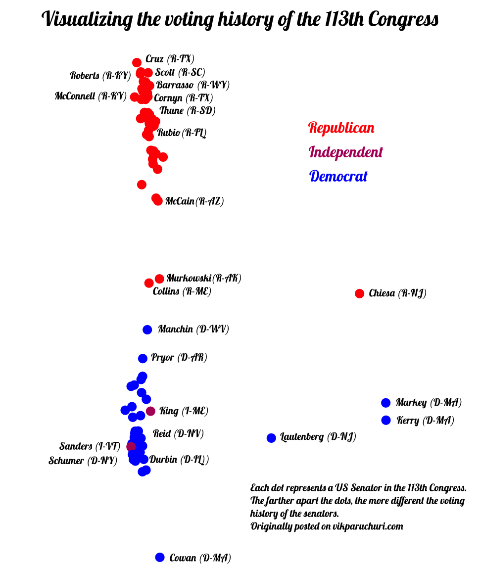
I was then able to turn this data into two dimensions and plot it to show how the voting patterns of the senators differed. This led to the plot below:
 From the above plot, it appears that the Massachusetts and New Jersey senators are very extreme in their voting patterns. Both Juan Carlos Borrás and Fr. pointed out in the comments that this was due to the coding of the votes. Massachusetts and New Jersey had senators who were changed mid-term, causing their votes to be coded as a 3. Since nobody else had votes coded as a 3, this caused them to appear like they had very different voting patterns, when in fact, they just were not there.
I had known of the 3-coding initially, but opted to keep the data “as-is.” The more I think about it, the more I realize that this could be used to spin a false narrative. I easily could say “democrats tend to be very extreme in their voting, just look at John Kerry!”, or “Massachusetts is the most radical state in the country!” based on the above chart. Of course, neither of these statements are strictly true, but the chart above, which is based on accurate data, could be used to tell such a story.
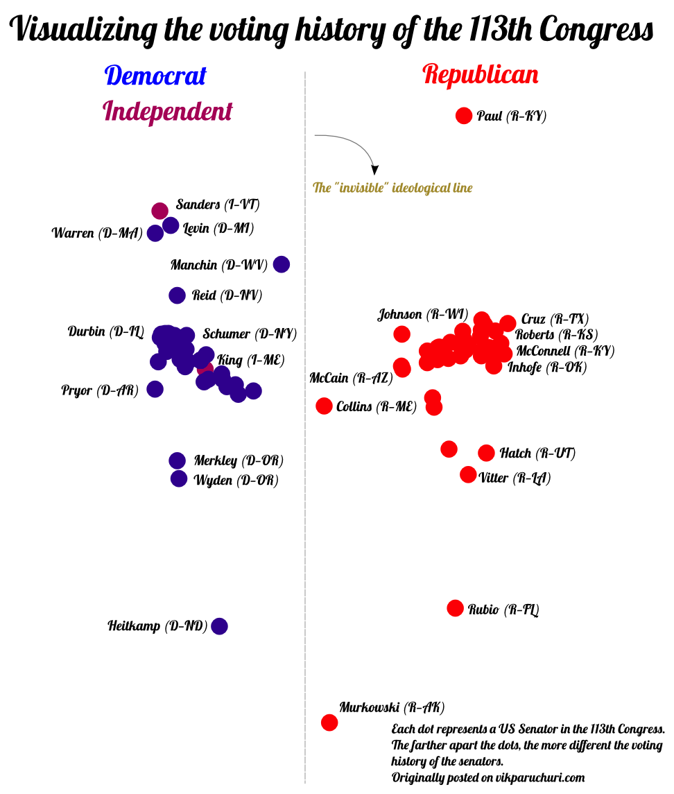
If we reconstruct the chart without any senators who were switched mid-term, we can tell a very different story.
Our new story
 The above plot is an updated version, and tells our new story. As we can see, the new story shares a lot of similarities with the old story – we still see that Collins and Murkowski are close to the center ideologically, and we still see that there is a clear ideological dividing line between the parties.
A key difference is that both dimensions are meaningful now. The x dimension is telling us how far the parties are from each other, and the y dimension is telling us how much variation there is within each party. We still see solid voting clusters around party leadership, but we also see senators such as Paul and Heitkamp who vote significantly differently from their own parties (but not in a way that moves them in the ideological direction of the other party).
Looking at the “most extreme” senators again gives us all Republicans, which makes sense, as they are the party out of power, and are thus the farthest from the “average” view.
What lessons can we learn?
Any data visualization can be manipulated, sometimes unconsciously, to weave a certain tale. Often, this tale can be backed up with data. This brings us to the major trap of visualizations. They can simplify data to the point where it is comprehensible. Coupling the power of a machine to rapidly scan large amounts of data and the power of a human to recognize patterns can lead to powerful insights. But unless it is clearly spelled out how the visualization came to be, and we think clearly about it, we risk something being oversimplified, often to the point where the meaning that is conveyed is different from the actual meaning of the data. By simplifying, we remove understanding.
This problem can be addressed in two broad ways, I think. One is to publish the source data and methodology for creating the visualization. In my case, this coupled with some smart readers led to a good catch. The second is to directly allow the viewer to manipulate the visualization in a data-driven way. This would allow a viewer to draw their own conclusions, without the preformatted data being given to them. D3.js and shiny allow this, and I would like to play around with them to see if it is feasible to make visualizations in this way.
If you have any other ideas for balancing simplification and understanding, please let me know.
